
| The Typefaces from Karlgeorg Hoefer | |||
| written by Otmar Hoefer | |||
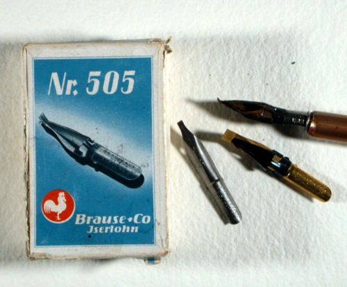
| As a joung boy in Hirschberg, Silesia, my father was fascinated by the local stationary shop and its attached printing shop. He saved his forst pocket money to buy his own fountain pen and his own calling card. His father was shocked. This anecdote shows how early his fascination for type and printing began to develop. He wrote with the fountain pen and during his apprenticeship in the Rauhen Haus in Hamburg, he missed no opportunity to write out signs and certificates. This talent was noted as a particularly well-developed skill in the recommendation from his apprenticeship. His first hot metal type face developed from a piece of his writing done with the broad nib Brause 505, his own invention, with this nib he could produce broad, thick strokes as well as extremely thin lines. |
|||
 |
|||
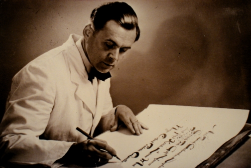
| The expressive forms of his first type face are reminiscence of brush strokes and they impressed Karl Klingspor, the owner of the Klingspor Type Foundry (Schriftgiesserei Klingspor) in Offenbach. He produced this type face with the name »Salto« in 1952. The type face is recognized today as the embodiment of type face design from the 1950s. The capitals are extremely broad and the lower case letters are in contrast, very narrow. At the request of the type foundry Klingspor, Karlgeorg Hoefer developed a narrower set of capitals to match the lower case forms, and this type face was produced in 1954 as »Saltino«. |
|||
 Saltino Saltino |
|||
| In addition, he designed a further variation, Saltarello, with the caps of Salto and new, larger lower case letters. This typeface was never produced commercially. Sketches and proofs exists. | |||
|
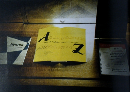
In 1955, D. Stempel AG came out with a new display typeface called »Monsun«. Like Salto, it had a spirited, brush like character, but narrower space saving forms. This typeface could even be used in small point sizes. |
|||
 |
|||
 |
|||
|
|||
 |
|||
 |
|||
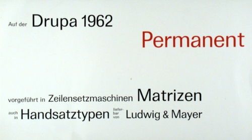
| Sometime before 1962, Ludwig and Mayer commissioned from Hoefer the design of a new austere sans serif typeface family. The typeface was called »Permanent« and over a ten year period, Karlgeorg Hoefer developed it into a full family. Like Univers or Folio, Permanent is based on transitional forms. The weights were drawn and finished in the following order: Permanent light 1971, regular 1962, italic 1967, bold 1962, black 1962, condensed 1967, black condensed 1967, light extended 1979, regular extended 1963, bod extended 1963, extra bold 1967. In addition he also designed Permanent Headline with Headline outline. In 1964 and 1969 Headline italic was added. This typeface had no descenders in its primary character set, meaning that the g, j, p, q and y were so compressed that they it in a line with no further leading. There were of course alternate letters with descenders, although they required additional leading by the hot metal typesetter. This display type became famous under the name »Headline«. |
|||
 |
|||
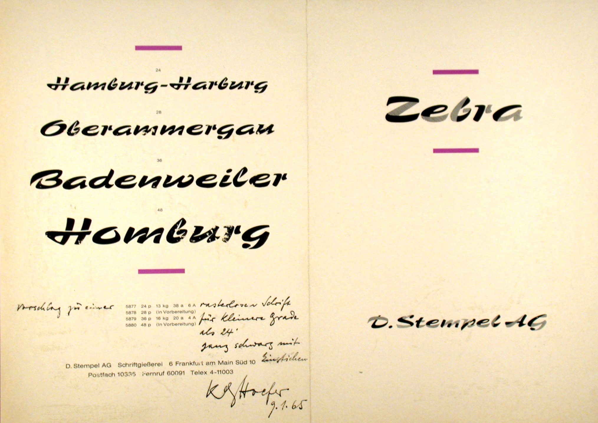
| Hoefer's most unusual type face was probably his experiment with a brush face which he designed as a partly black and partly grey drawing. The optical effect of this typeface was completely new and different, but how should the grey be produced? The punch cutters of D. Stempel AG ad an answer. The areas that should be grey were made from cross hatched lines: The typeface was released by D. Stempel AG and appropriately named »Zebra«. |
|||
 |
|||
 Stereo Stereo |
|||
| Hoefer's experiment with typefaces forms and spatial representation began very early on. The first sketches of his typeface »Stereo« found in his papers was dated 19557. In addition he also tried various forms and fillings. The finished typeface was first produced by L+M in 1968. The partial lack of form pieces resulted in an airy, open typeface. He loved listening to his stereo, hence the name for this type face. The stereo sound and forms of his typeface expressed the feelings of spaciousness. | |||
 |
|||
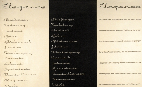
| In 1968 L+M released the calligraphy typeface »Elegance«. (Which was digitized by Canadatype under the name Sincerely.) It had a delicate, almost even stroke and extremely extended letter forms. It is very light and airy and ideal for invitations and other personal correspondence. Insiders know that this typeface is based on Hoefer's own handwriting. He used the fine Rotring Rapidograph "Tusche" pen. | |||
 |
|||
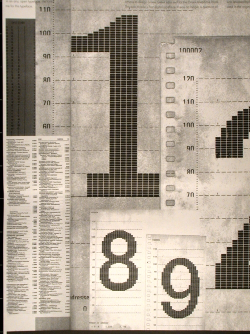
| In 1970 Karlgeorg Hoefer was commissioned by JT Hellas, Athens to design a new Greek sans serif typeface »Programm-Grotesk« for the Greek telephone books. This was Hoefers first digital typeface. It was no longer a question of drawing finished characters, now every element had to be seen as a collection of small squares and the characters were produced as the correct bitmap, according to the point size: The typeface was made for the first digital typesetting machine, the »Digiset« of the company Dr. Ing. Rudolf Hell, Kiel. Hoefer paid particular attention to the legibility of the Greek characters and the numerals. | |||
 |
|||
| In 1974, he wrote the entire text of the book Our First Primer »Unsere neue Fibel«, which was released by the Klett Verlag in Stuttgart. The school script that was used in the original had a number of decorative elements and a number of alternate characters depending on their position in a hand written word. The typesetting machines could not work with this large number of characters and their contexts, so Hoefer worked together with Berthold AG in Berlin to develop his own glass master fonts of this »Lateinischen Ausgangsschrift« (Latin basic letterform) for the Diatype photo typesetting machine. This typeface was available shortly after for the Linotype phototypesetting machines as well. The form of the Lateinische Ausgangsschrift were not to Hoefers satisfaction and he worked together with the "Arbeitsgemeinschaft Schreiberziehung" on a somewhat simpler method of writing forms which could be easier to write for the primers. The decorative loops and forms were reduced to the essential writing forms and the typeface was produced for the Klett Verlag at Berthold and Linotype with the name »Vereinfachte Ausgangsschrift« or shortly just »VA-Schrift« |
|||
 |
|||
| Another experiment of Hoefer led to the black extended display typeface with its elegant letterforms called »Bigband«. In 1974 released in hot metal from Ludwig + Mayer (L+M) in Frankfurt. Its bold forms are striking and often used in display advertisements: As a lighter complement to this typeface Hoefer also created a variation which never was realized although a sketch still lies in the drawer. | |||
| In 1990 Linotype started the project »Type Before Gutenberg« under the direction of Adrian Frutiger. It is a set of different volumes of fonts whose characters are based on the forms designed by scribes in the times before Gutenberg invented the hot metal character and the printing machine. The projects purpose was not to just copy these forms out of old books and digitize them, rather contemporary calligraphers were to design their own interpretations based on the old letter forms. Linotype put together a team of calligraphers from the Schreibwerkstatt-Klingspor (calligraphic association) in Offenbach am Main to work on this project. Karlgeorg Hoefer, Prof. Gottfried Pott and Herbert Maring were the members of the team. |
|||
 San Marco San Marco |
|||
| For the first package Hoefer created in 1990 »Omnia«, a classical uncial all caps typeface with sacred overtones and »San Marco«, a gothic typeface with the traditional long s. | |||
 Notre Dame Notre Dame |
|||
| In 1991 he started to work on the typeface ”Notre Dame“, a successful gothic face with matching decorative elements, which appeared in the second package of the »Type Before Gutenberg« Series. | |||
| A further series »Calligraphy for Print« was created in 1992, to which Hoefer contributed the brush script »Sho«. This striking typeface has very generous forms. It was created with a broad brush and shows the strong expressive strokes. It was originally going to be named after the comedian Charlie Chaplin because when examined carefully, the lower case c looks like a sleeping man in a boat: This idea had to be discarded due to copyright issues and the typeface was finally given the name Sho to signify its almost Japanese writing stile. |
|||
 »Beneta« »Beneta« |
|||
| In addition Hoefer also added a French hybrid typeface named »Beneta«, which was also part of the Type before Gutenberg project. It is now available from Linotype at www.Linotype.com |
|||
 |
|||
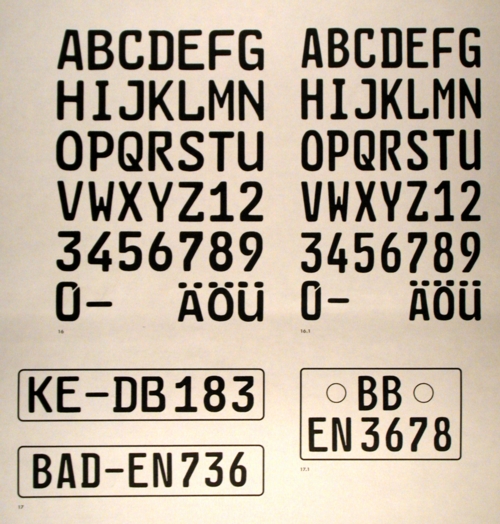
| In the 1970s, the German Ministry of Transportation commissioned Hoefer with the design of a new anti-counterfeit typeface for vehicle license plates. This was a large project and a challenge on which he cooperated with the signage manufacturer Dambach-Templin. The typeface used on the existing plates was DIN Grotesk, a face where one could easily change an F into an E with a single black stroke. Many other letterforms could be easily changed into another. The typeface forms from the later known face »FE-Schrift« were idiosyncratic but they could not be changed easily, as was the case with the old DIN typeface. The testing of the typeface went on for years and its forms were changed so much that in the end, it was a complete different face from Hoefers Original. The typeface was then lost during the change of the government: With the introduction of the new European Union license plates, the signage manufacturer Utsch remembered this typeface and dug it out if the archives. Its unique forms inspired hot debate bit it is now part of our daily lives, seen on German license plates everywhere. |
|||
| Otmar Hoefer |
|||
 Monsun
| Calligraphy | |
| Works | |
| Typefaces | |
| Workshops | |
| Family history | |
| Live story | |
| Links | |
| Contact |